Peyton wrote the following short paragraph and created the graph below it to support her research on the cities with the largest populations in the United States.
“Everyone knows that New York is the largest city and has been for years. Here is a graph that shows the populations of the next nine largest cities in 2010 along with their populations in 1990.”
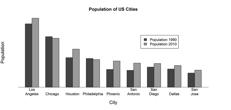
A teacher criticized this graph for being incomplete. Which of the following questions could NOT be answered using only this graph?
(A) Did the population of Chicago decrease or increase from 1990 to 2010?
(B) What is the approximate population of each city in 2010?
(C) In terms of population, did the order of the cities (from largest to smallest) change from 1990 to 2010?
(D) In terms of population, what is the order (from largest to smallest) of these nine cities in 1990?
Standards
6.SP.4: Display numerical data in plots on a number line, including dot plots, histograms, and box plots.
Correct answer and commentary
Student performance
This question requires students to be able to read and interpret data presented in a bar graph to determine which of the given questions could not be answered using the given, incomplete, bar graph.
The most notable exclusion from the graph is a scale on the y-axis. As a result, we cannot determine an estimated population for any of the given cities in either of the particular years shown. We CAN however, make comparisons between cities and between years by examining the relative heights of the bars. Option (A) requires examining general changes between years for one city, so we could answer that question. Options (C) and (D) both require comparing across cities to determine which populations are higher and lower than the others. Again, we can answer this question because it asks to compare relative populations across cities. Option (B) is the correct choice because it asks for an approximate population in each city, which would require the presence of a scale on the y-axis.